
Real estate brochures are one of the most effective tools for presenting a property’s best qualities in a visually appealing format. Whether used in print or digital form, a well-designed brochure can capture attention and help potential buyers quickly understand what makes a property special.
The most successful brochures do more than list square footage and room counts.
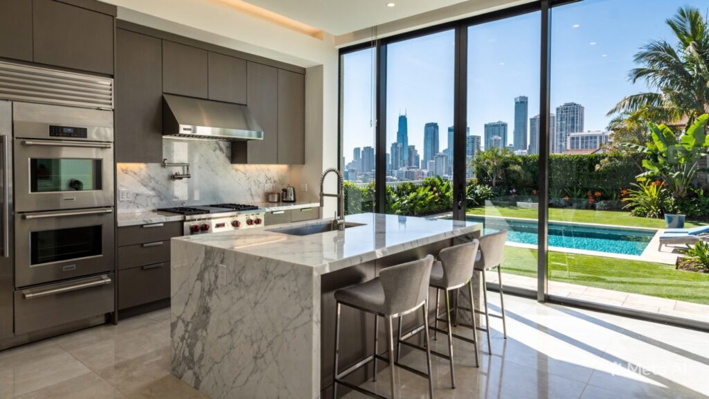
They strategically emphasize standout features such as renovated kitchens, scenic views, smart home technology, and premium amenities.
By creatively highlighting these details, agents can create stronger emotional connections and improve buyer engagement.
Understanding the Purpose of Property Feature Callouts
Feature callouts are design elements used to draw attention to specific selling points within a brochure. These may include bold text, icons, labels, color blocks, or short descriptive captions.
Their purpose is to guide the reader’s eye toward the most compelling aspects of the property.
Instead of requiring buyers to search through dense text, callouts make important information immediately visible.
This technique improves readability and ensures that memorable features stand out.
Using Bold Headlines to Emphasize Key Selling Points
One of the simplest and most effective strategies is to use bold headlines for major property features. Phrases such as “Chef-Inspired Kitchen,” “Panoramic City Views,” or “Private Backyard Oasis” instantly communicate value.
These concise headings create visual hierarchy and make the brochure easier to scan.
When paired with high-quality images, they reinforce the property’s strongest advantages.
Strong headlines also help buyers remember the features that differentiate the home from competing listings.
Incorporating Icons and Visual Symbols
Icons are an excellent way to present information quickly and attractively. Symbols representing bedrooms, bathrooms, parking spaces, pools, or energy-efficient features provide instant recognition.
Visual symbols reduce text clutter while improving overall design.
They also make the brochure feel more modern and professional.
When used consistently, icons create a clean and polished look that enhances the reader’s experience.
Highlighting Amenities with Colored Boxes and Labels
Colored boxes and labels are highly effective for calling out premium amenities. Features such as “New Roof 2025,” “Solar Panels Installed,” or “Walking Distance to Schools” can be placed in eye-catching sections.
These design elements create contrast and naturally draw attention.
They break up the layout and help important details stand apart from body text.
Strategic use of color can also reinforce brand identity and add visual interest.
Pairing Feature Callouts with High-Quality Photography
Property images are central to every successful brochure, and feature callouts become even more powerful when placed near relevant photos. A caption such as “Custom Marble Countertops” placed beside a kitchen image provides immediate context.
This pairing strengthens the visual story and helps buyers imagine themselves in the space.
It transforms static photographs into persuasive marketing assets.
Professional photography combined with concise callouts significantly increases brochure impact.
Using Testimonials and Lifestyle Descriptions
Another creative approach is to connect features to lifestyle benefits. Instead of simply stating “Large Patio,” a brochure might say “Perfect for Weekend Entertaining and Family Gatherings.”
This wording helps buyers understand how the feature enhances daily life.
Testimonials or agent notes can also add credibility and emotional appeal.
Lifestyle-focused descriptions turn technical details into relatable experiences.
Creating Comparison and Value Highlights
Real estate brochures can also use feature callouts to emphasize investment value. Phrases like “Recently Upgraded HVAC System” or “Low-Maintenance Landscaping” communicate practical benefits and potential savings.
These details reassure buyers that the property is well-maintained and thoughtfully improved.
They can influence purchasing decisions by highlighting long-term advantages.
Value-based messaging is particularly effective for budget-conscious buyers.
Keeping the Design Clean and Balanced
While feature callouts are powerful, they should be used selectively to avoid visual overload. Too many highlighted elements can distract from the overall presentation.
A balanced layout ensures that each callout receives appropriate attention.
Consistent typography, spacing, and color choices create a cohesive and professional design.
The goal is to guide the reader smoothly through the brochure while emphasizing the property’s strongest assets.
Conclusion: Turning Property Details into Persuasive Marketing
Creative feature highlighting transforms ordinary real estate brochures into compelling sales tools. By using bold headlines, icons, color accents, photography, and lifestyle-driven descriptions, agents can showcase what truly makes a property stand out.
These techniques improve readability, strengthen emotional appeal, and help buyers focus on the most desirable aspects of the home.
When thoughtfully designed, a brochure becomes more than an information sheet—it becomes a persuasive marketing piece that inspires action.